Un editoriale pubblicato da Science richiede ufficialmente che l’indice di massa corporea venga mandato in pensione, dal momento che non è sempre indicatore del reale stato di salute di un individuo.
Uno studio del 2011 e uno di quest’anno, del Cdc di Atlanta, hanno rilevato che le persone ritenute sovrappeso secondo la formula del BMI (cioè con indice compreso tra 25 e 30), tendano in realtà a vivere più a lungo di quelle ritenute “normali” dal calcolo. Secondo altre ricerche l’attività fisica riduce la mortalità indipendentemente dall’indice di massa corporea, quindi persone che lo hanno più alto potrebbero essere a minor rischio rispetto ai magri.
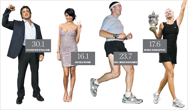
► NUOVA FORMULA INDICE DI MASSA CORPOREA
Come affermato da Rexford Ahima e Mitchell Lazar dell’università della Pennsylvania, il BMI non riflette in maniera corretta la proporzione tra muscoli e tessuto grasso nel corpo, inoltre non tiene conto del genere e delle differenze di razza tra le persone. L’accumulo di grassi in alcune aree del corpo sembra dannoso inoltre, mentre in altre sembra poco pericoloso. Come sottolineato dagli esperti, anche un BMI basso può nascondere uno status nutrizionale povero, in cui il corpo non riesce a metabolizzare correttamente alcune sostanze, perciò l’indice si rivela ancora una volto poco affidabile.
Secondo il pensiero degli studiosi, bisogna trovare mezzi accurati e pratici per misurare la composizione del corpo e il livello degli ormoni per individuare l’obesità e predire il rischio di morte. Una delle proposte prevede l’uso dell’Absi (A Body Shape Index), il quale tiene conto anche della circonferenza della vita, dove si trova il grasso più cattivo. Potrebbero essere utili anche altri parametri come la misura dei cosiddetti ormoni dell’adipe, miochine e citochine.
As I compared different online shops with strong visual presentation, I came across explore this goods hub – The layout is well-organized, and the product display feels engaging and easy to navigate.
While scanning through niche online directories and curated resource lists, I noticed something that stood out for its usability and clarity, especially where Copper Cove vendor portal appeared – this seems like a solid platform overall, with content that is clearly organized and accessible for smooth browsing.
During a casual exploration of niche commerce platforms and design-focused listing pages, I noticed something that stood out for its elegant naming but limited detail depth, particularly Cove Vale studio vendor link – The Vale name gives a classy impression, though product descriptions are noticeably too short to fully understand the offerings.
В клинике «Ось Здоровья» лечение строится так, чтобы пациент не оставался один на один с уязвимым периодом после прекращения употребления. Даже при хорошем старте первые ночи часто становятся испытанием: тревога усиливается, сон не приходит, появляется ощущение внутреннего напряжения. Когда есть план на 24–72 часа и поддержка по динамике, риск срыва снижается.
Изучить вопрос глубже – https://narkologicheskaya-klinika-klin12.ru/
While browsing through several niche directories and casual recommendation threads, I stumbled across something that might be worth a deeper look, especially for those who enjoy uncovering lesser-known sites like this hidden gem – it seems fairly promising at first glance, so I’ll probably return later and evaluate it more thoroughly after some proper exploration.
During usability testing of ecommerce trade hall systems and glass inspired UI kits, testers found a navigation module containing glass harbor vendor trade hall showcase portal embedded mid layout, and although the glass aesthetic gives a fragile impression, the website runs smoothly and efficiently today during performance and interaction testing sessions across multiple devices
Users who appreciate minimal cozy marketplace design often browse sites such as Market Meadow Ember Collection where content is structured clearly – The interface creates a browsing experience that feels organized, smooth, and welcoming.
During a detailed review of online artisan marketplaces with diverse offerings, I noticed visit this oak cove craft hub – The variety is impressive, and the browsing experience feels enjoyable, making it worth spending extra time exploring different products.
oakmeadowvendorcollective.shop – Really clean product photos, descriptions are helpful too.
During review of fabric themed ecommerce platforms I noticed within the central content area a listing featuring soft cotton meadow trade hub and even though the design feels smooth and inviting, repeated logout cycles interrupt browsing and make the overall experience less enjoyable than expected for users.
As I compared several digital agencies online, I noticed tap here to explore – The site offers a clean and organized layout, helping users engage with the content in a smooth and professional way.
Shoppers often evaluate online platforms based on ease of use catalog diversity and transaction reliability particularly when discovering services like Vendor Network Exchange – users benefit from a clean interface and structured workflow that enhances purchasing confidence while reducing unnecessary complexity in browsing
Many shoppers browsing handcrafted ecommerce sites value smooth user experience and clear organization when interacting with platforms like Chestnut Cove Artisan Flow Store – the design ensures that users can move through categories effortlessly, maintaining focus on products – the interface supports both efficiency and visual comfort throughout.
As I explored examples of carefully curated online artisan shops, I checked see this artisan link – The layout feels intentional and creative, and browsing offers a visually pleasing and organized experience.
During browsing of niche online marketplaces I came across Harbor Moon vendor lounge entry portal – The design is calm and appealing, but I find the lack of detailed product imagery makes it harder to evaluate listings properly.
While scanning through niche directories and online discovery threads, I noticed something that felt well structured and easy to process, especially where Harbor vendor marketplace link appeared – I like how simple the layout is overall, since it helps make navigation feel quick and effortless.
Across prototype UI testing and ecommerce marketplace environments, developers observed content modules featuring cove rose market parlor vendor hub link within layout flow, and while the rose cove theme suggests romance and elegance, the parlor section is entirely empty boxes which reduces engagement and clarity during usability testing sessions
While going through multiple niche listing platforms and marketplace collections, I found something that appeared elegant but slightly lacking in detail, especially where Vale cove vendor studio page appeared – The name Vale sounds classy, but product descriptions are too short for proper insight.
During a final comparison of artisan marketplace websites, I found see upland cove artisan hub page – The user interface feels clean and simple, and I had no trouble finding items quickly throughout the browsing experience.
During analysis of ecommerce platforms I found a structured and user friendly interface where Harbor marketplace listing board Harbor marketplace listing board embedded in page flow enhances usability – The vendor hall supports smooth navigation and organized listings helping users find products quickly while maintaining a clean browsing environment interface design.
Across prototype ecommerce environments and UI vendor frameworks, developers identified embedded navigation content containing amber vendor ridge parlor access entry node within page structure, and although the branding feels natural and grounded like amber stone, the vendor parlor section looks like a temporary placeholder which reduces usability clarity during testing cycles and system analysis
During my search for interesting and potentially valuable resources online, I found a mention that seemed somewhat promising, especially when I noticed this option here – it gives a good first impression, so I’ll likely come back to it later.
As I browsed multiple coastal and outdoor themed supply sites, I focused on design clarity and user flow, and during that process I encountered Vale Harbor Gear Point – revised commentary: navigation feels smooth and logical, with a layout that supports quick browsing and easy comprehension of product sections across the entire interface.
While browsing digital commerce sites I discovered within the main content area a section showing harbor creek vendor trade hall and although the creek inspired theme feels pleasant and natural, the search filter not working correctly makes the browsing experience less practical and more frustrating overall.
Exploring niche handmade marketplaces online often reveals platforms that emphasize creativity, user friendly navigation, and visually appealing product organization for buyers and sellers Nightfall Craft Bazaar providing curated browsing experiences and smooth category filtering tools for improved discovery overall – This platform is often appreciated for its aesthetic layout, fast responsiveness, and simplified shopping journey that enhances overall user satisfaction
During frontend inspection of ecommerce sandbox platforms and vendor directory UI systems, developers identified a central module featuring harbor zen vendor parlor staging entry portal integrated into structured layout, and despite the calm zen aesthetic, intrusive popups frequently appear which disrupt browsing continuity and reduce usability during testing sessions and evaluation stages
pebblecreekcraftexchange.shop – Will order again next month, hope they restock soon.
wettanbieter curacao
Here is my web-site … sportwetten tipps kaufen legal
As I explored different online marketplace listings and curated commerce pages, I noticed something that felt creative in naming but weak in trust indicators, particularly with Brook vendor velvet foundry hub – The Foundry name is quite unique, though trust badges would help here to make the platform feel more secure.
sportwetten quoten vergleichen
Have a look at my web page :: live wetten Basketball tipps
During research into calm and minimal digital storefronts, I explored browse this nature shop – The presentation is simple, and navigation feels easy and intuitive for users.
During browsing of discount trade platforms I came across Nightfall trade house commerce deals hub – The offers looked great, but I left after the checkout process raised doubts about safety and reliability overall.
Users who enjoy fast paced digital shopping environments often engage with sites such as Merchant Harbor Quick Path where navigation is designed to be direct and efficient – The browsing system reduces complexity and improves usability, helping users quickly locate products while enjoying a clean and intuitive interface.
Помимо физиологических факторов, важную роль играет психологическая устойчивость пациента. Длительный запой формирует патологическую потребность, при которой человек утрачивает способность добровольно отказаться от очередной дозы в привычной среде. Изоляция в условиях клиники разрывает этот цикл, создавая пространство для мотивационной работы и снижения тревожности. Специалисты клиники работают с когнитивными искажениями, поддерживающими аддикцию, и помогают справиться с внутренним сопротивлением лечению. Такой подход особенно важен при сочетанных расстройствах, когда алкогольная зависимость сопровождается депрессивными проявлениями или генерализованной тревогой.
Подробнее можно узнать тут – [url=https://vyvod-iz-zapoya-v-staczionare-nizhnij-novgorod-9.ru/]стационар вывод из запоя нижний новгород[/url]
gratis sportwetten guthaben ohne einzahlung; http://gratis-wetten.com,
strategie erfahrungen
Across prototype ecommerce environments and UI vendor frameworks, developers identified embedded navigation content containing marble vendor harbor trade gallery access node within page structure, and although the design feels polished and elegant like carved marble, the images remain low resolution which reduces overall presentation quality during usability testing and system analysis cycles
online lay wetten deutschland schweiz legal
While analyzing various vendor focused ecommerce systems I found a well organized interface that helps users move through categories without confusion Chestnut vendor trade house hub and it maintains a reliable browsing structure that makes product discovery straightforward while keeping the layout visually appealing and easy to understand for everyday users.
Across ecommerce sandbox UI evaluations and gallery marketplace prototypes, testers noticed navigation components containing golden trade harbor vendor gallery access hub embedded in page flow, and although the interface feels professionally designed, the gallery is empty of real images which reduces engagement during usability testing sessions and performance checks
While exploring digital trade websites I came across a content block containing creek harbor shop trade house hub and although the visual identity is clean and structured, it feels almost like a duplicate of tradehall which makes it difficult to distinguish between them quickly.
coworking website coworking space nearby
horse racing results lingfield
My blog post :: https://horse-betting.Com/
E-commerce environments designed with structured navigation systems often provide smoother browsing experiences and improved user engagement across all sections Merchant Network Hall – It features a clearly organized vendor layout that makes it easy for users to explore different categories while maintaining a seamless browsing experience overall
As I explored various online commerce directories and niche listing pages, I found another platform that seems to follow a repeated branding structure, particularly Cove commerce velvet atelier hub – This is clearly another velvet-themed domain, and it’s becoming easier to recognize the pattern across these entries.
During analysis of visually soothing storefront designs that prioritize user friendliness and soft presentation style I noticed embedded content where Brookside Velvet Hub appears naturally in the interface – updated note overall structure feels balanced gentle and easy to navigate supporting a relaxed browsing journey across categories
In the middle of reviewing several suggested resources and lesser-known links, I encountered something that seemed worth keeping in mind, particularly where this interesting hub appeared – it feels relevant and straightforward enough, so I’ll explore it in more depth when I have time.
As I analyzed several stylish eCommerce platforms built around boutique concepts, I found check this fashion boutique – The interface is streamlined and elegant, and the browsing experience feels smooth with a consistent visual flow.
As I reviewed retail district platforms for speed and stability, I noticed check oak retail district online – The browsing experience is smooth and reliable, with no lag or confusing interface behavior throughout the site.
While exploring commerce-style websites I came across Oak Cove marketplace entry portal – The layout is clean and straightforward, but not having a search bar makes navigation feel slower and less efficient overall.
While browsing through different niche discovery threads and marketplace listings, I came across something that seemed well structured and accessible, especially when seeing Coral vendor meadow hub included – It’s a pretty decent site, and navigation works well without confusion, making the overall experience easy and clear to use.
During a final comparison of craft exchange websites, I found see pebble creek artisan craft exchange hub – I plan to order again next month, hoping they restock because the overall experience was enjoyable and worth returning to.
During staging reviews of ecommerce marketplace frameworks and UI sandbox environments, testers encountered a central block featuring market golden cove vendor parlor showcase portal within layout structure, and despite the consistent design language, the repeated golden naming structure across multiple pages makes the pattern increasingly apparent during comparative testing analysis sessions
During UX evaluation of sandbox ecommerce systems and vendor marketplace prototypes, testers found embedded navigation containing plum harbor vendor room access console node inside structured layout, and although the plum harbor aesthetic feels bright and fruity, the vendor room has zero vendors listed which weakens user engagement during usability testing sessions
sportwetten ohne oasis Paysafecard Wettanbieter
While going through different vendor directories and curated marketplace platforms, I came across something that felt organized but visually muted, especially where Violet brook commerce foundry hub appeared – The violet theme is promising, though it would benefit from stronger purple accents to make it visually stand out more.
gratis tipps sportwetten
Also visit my blog post – sichere wetten strategie (Wendy)
Exploring handmade culture and seasonal crafts often leads visitors to unique online spaces where creativity thrives, and while browsing different collections one may encounter artisan showcase portal that highlights diverse makers and continues offering an enjoyable discovery experience for casual shoppers and enthusiasts alike. – A vibrant artisan marketplace introduces fresh handmade creations and delivers a smooth, pleasant browsing journey for curious shoppers.
In the middle of scanning ecommerce marketplaces I noticed a section containing crown cove vendor product room and while the royal branding is visually strong and consistent, the blurry product images make navigation less satisfying and reduce trust in the platform’s overall presentation quality.
Developers and users alike have noted that the structure supports efficient browsing, with clearly separated sections that help reduce confusion during daily operations Harbor Marketplace Access Gateway Panel this makes it easier for vendors to locate essential features while maintaining a consistent experience across different devices and screen sizes.
В клинике «Вектор Стабильности» помощь строится как понятный маршрут. Сначала врач оценивает риски и состояние, потому что одинаковых случаев не бывает: у одного на первый план выходит давление и сосуды, у другого — паника и бессонница, у третьего — выраженная интоксикация и обезвоживание, у четвёртого — срывы на фоне стресса и истощения. Затем выбирается формат лечения: стационар, амбулаторная программа или помощь на дому, если это безопасно. После первичного облегчения обязательно формируется план на первые 24–72 часа — это период, когда чаще всего происходит повторное ухудшение вечером и ночью, и без ориентиров человек легко возвращается к употреблению «чтобы отпустило».
Выяснить больше – http://narkologicheskaya-klinika-noginsk12.ru/
While comparing artisan outlet website usability, I discovered browse vale cove outlet marketplace hub – The platform helps with browsing, and I came across several interesting options quickly thanks to its simple and organized structure.
During an analysis of softly designed artisan marketplace websites, I noticed open this rose mart page – The design is calm and structured, and products are displayed in an attractive way that supports easy browsing.
While reviewing staging ecommerce vendor systems and UI marketplace templates, analysts noticed a content block featuring harbor vendor stone hall construction console node integrated into layout flow, and despite the strong stone harbor concept implying durability, the vendor hall section is still under construction which reduces completeness and usability during testing sessions and design reviews
While scanning through marketplace listings and vendor hubs, I found a platform with Market harbor Juniper hall portal entry – It looks promising overall, so I might return after a few weeks for another look.
During a casual browsing session through niche resource pages and online listing hubs, I noticed something that stood out for its reliability and structure, particularly Harbor flora trade hub – The site loads fine without issues, and the overall experience felt smooth and pleasant, so navigating through content was simple and enjoyable.
beste deutsche wettanbieter
Also visit my website; handicap bei wetten (Dolores)
While casually browsing through user recommendations and curated content, something caught my attention slightly, especially where this convenient hub was mentioned – everything seems to run without confusion, so I might explore it more thoroughly later on.
During staging reviews of ecommerce marketplace systems and UI prototype frameworks, analysts encountered a central block featuring meadow vendor quartz hall console entry node within layout structure, and despite the crystal quartz design language, the market hall is empty today which reduces usability and engagement during testing sessions
Users who prefer digital trading ecosystems that emphasize reliability and structured catalog access often browse platforms designed for efficiency and transparency and while doing so they may come across foundry trading portal which serves as a centralized environment for multiple trading categories and helps users explore different services with ease while maintaining a clear browsing structure. – A streamlined marketplace concept offering organized trading pathways and improved accessibility for online shoppers.
Капельница от похмелья в Самаре: восстановление после алкоголя, снятие симптомов и медицинская помощь в наркологической клинике «Детокс»
Подробнее можно узнать тут – [url=https://kapelnicza-ot-pokhmelya-samara-16.ru/]капельница от похмелья вызов на дом[/url]
During research into structured artisan emporium websites, I explored explore solar orchard marketplace emporium – Great for gift shopping, everything arrived in one piece and was securely packed.
While exploring vendor marketplace systems I discovered a central content block showing crown harbor trade vendor hall hub and although the branding looks polished and professional, the lack of actual vendor details and reliance on placeholder text makes the platform seem non functional for real browsing.
During usability testing of ecommerce marketplace systems and UI sandbox environments, testers found a navigation module containing zen cove goods room vendor access portal embedded mid layout, and although the zen cove branding feels peaceful and soothing, the goods room section is entirely empty which disrupts user expectations during interaction testing and evaluation processes
While scanning through online trading platforms and marketplace gallery directories, I came across something that felt structurally fine but misleading in content focus, especially where Violet harbor gallery trading link – The harbor name shows up again here, but the gallery section has zero artwork, which feels oddly misplaced.
During a comparison of modern commerce hub platforms and their informational clarity, I came across discover upland canyon market hub – The experience seems decent, and the content is useful and easy to understand without unnecessary complexity.
ferncovevault – Vault style neat, content feels organized and carefully structured overall
Feedback often highlights the simplicity of the browsing structure, particularly when users open Cove Goods Explorer Console where everything feels accessible – product organization remains clean and helps users maintain focus while searching through available items
While checking out lesser-known ecommerce sites I found this platform Kettle Crest bargain market and the deals appear extremely low priced, making me question whether this is a legitimate clearance outlet or something less reliable.
While going through different niche listing pages and online directories, I came across something that felt clean and accessible, especially where Hazel Harbor trade link appeared – The structure is simple and well designed, so browsing feels comfortable and simple, making navigation straightforward and efficient.
Online visitors seeking practical shopping platforms often prefer straightforward navigation, and during exploration they may come across market foundry depot which presents items in a simplified format designed for fast browsing and quick decisions. – A functional marketplace designed for smooth transactions and user friendly browsing experiences.
While reviewing experimental marketplace UI systems and vendor directory platforms, developers observed embedded content featuring orchard quartz vendor hall console link inside structured layout, and although the quartz orchard branding feels imaginative and fresh, the vendor hall redirects to the homepage which weakens user trust during usability testing sessions
While reviewing ecommerce vendor systems and UI staging environments, analysts encountered mid layout content featuring trail vendor parlor harbor console entry embedded in structure, and despite the appealing trail concept and consistent design language, broken navigation links make it difficult for users to move through the site during usability testing
Exploring various experimental ecommerce layouts and artistic web interfaces reveals interesting patterns inside Crystal Cove empty showroom note – the page structure is carefully crafted, yet the lack of tangible goods or listings gives it an abstract gallery-like feel rather than a functional store
As I compared different craft marketplace websites for usability and originality, I came across explore upland harbor artisan craft zone – Navigation could improve, but products are unique and cool, making browsing still worthwhile.
During a final comparison of retail district websites, I found see upland cove retail marketplace – The design is clean and simple, and it feels comfortable to browse with a smooth and user-friendly experience across the entire site.
В клинике «Вектор Стабильности» помощь строится от безопасности к устойчивости. Сначала — оценка состояния, исключение опасных признаков, стабилизация. Затем — работа с тягой и триггерами, потому что после прекращения употребления именно бессонница, тревога и психическое истощение чаще всего толкают к срыву. Когда у пациента есть понятный план на уязвимые часы и поддержка по динамике, трезвость становится более управляемой.
Подробнее – https://narkologicheskaya-klinika-noginsk12.ru/chastnaya-narkologicheskaya-klinika-v-noginske/
During an analysis of visually appealing artisan websites, I noticed open golden craft outlet – The structure is clean and artistic, and navigation feels smooth with well-presented product sections.
Online visitors searching for thoughtfully arranged shopping experiences often explore platforms that feel modern and intuitive, where they might come across suncove design marketplace offering curated categories and – it enhances user engagement through clean layout design and smooth browsing functionality.
While reviewing various collections of niche resources, I found something that appeared clean and easy to follow, especially when I noticed this well-arranged site – it provides a natural browsing flow, so I might check it again soon.
While reviewing ecommerce vendor systems and UI staging environments, analysts encountered mid layout content featuring harbor vale vendor parlor gateway access node embedded in structure, and despite the maritime inspired branding of vale harbor, the parlor area feels like a ghost town which reduces engagement during usability testing and evaluation cycles
During a casual review of online market-style websites I came across Kettle Harbor Bazaar Hub – The design is visually pleasant, but I ran into multiple footer links that don’t load properly, which makes the overall structure feel incomplete and a bit rushed in development.
As I continued exploring various online listing directories and curated threads, I found something that seemed clean and easy to navigate, particularly with Cove honey browsing hub – The first impression is nice overall, and everything looks relevant and easy to read, making the experience feel natural and user-friendly.
During usability testing of ecommerce marketplace systems and UI sandbox environments, testers found a navigation module containing quick harbor house market vendor access portal link embedded mid layout, and although the branding suggests fast navigation and instant loading, the platform performs slowly which disrupts user flow during interaction testing and evaluation processes
People working with global commerce tools appreciate platforms that combine variety and organization to create a smooth browsing experience for users MarketBridge Control Hub – It provides structured navigation that helps users quickly find relevant trade options without confusion
During a casual review of vendor marketplaces and online commerce hubs, I came across something that felt clean but pricing-wise uncertain, particularly references like Cove walnut atelier commerce hub – The atelier branding is fancy and appealing, yet the pricing seems randomly generated without consistent structure.
Состав капельницы от похмелья зависит от состояния пациента и специфики его симптомов. Важно, чтобы капельница включала компоненты, направленные на улучшение общего состояния, восстановление водно-солевого баланса и поддержку работы внутренних органов.
Получить больше информации – [url=https://kapelnicza-ot-pokhmelya-samara-14.ru/]капельница от похмелья на дом самара[/url]
While comparing artisan exchange systems for usability, I discovered browse violet harbor craft exchange hub – The platform offers nice variety, and I can explore sections easily without losing my way.
In the realm of abstract ecommerce design studies and prototype storefront systems, users frequently encounter elements including Harbor Vendor Digital Hall interface which suggests structured categorization but offers limited actual product depth upon inspection – It feels like another recycled template often used for quick affiliate or dropship setups.
During UX evaluation of ecommerce sandbox systems and ember styled UI designs, developers found embedded navigation containing ember meadow market vendor parlor gateway inside structured layout, and despite the attractive design language, the overly long name makes the interface feel verbose and harder to scan during usability testing
Many online users who prefer structured shopping environments tend to browse platforms designed for clarity and convenience where product discovery is simplified and categories are well arranged for faster access and better comparison suncove goods atelier portal – This curated marketplace emphasizes a balanced mix of style and usability, offering visitors a seamless experience while exploring handpicked items across multiple thoughtfully organized sections.
As I continued exploring different marketplace platforms and vendor listings, I came across something that felt nearly identical to an earlier viewed site, particularly with Cove atelier vendor walnut link – The resemblance is so strong that it makes me question whether both sites are part of the same ecosystem or just cloned variations.
While studying online craft emporium interfaces and checkout experience, I came across visit vale harbor artisan goods emporium – The site works well on phone, and checkout was smooth today with a seamless process overall.
While going through different online directories and marketplace-style listings, I found something that seemed clean and accessible, especially when seeing Honey market meadow link included – Enjoyed looking around here, with a neat and user friendly layout that makes browsing feel smooth and effortless overall.
As I explored various marketplace listings and vendor hall platforms, I found a site with an eye-catching name but not much depth, particularly Harbor vendor Aurora hall commerce link – The Aurora branding stands out, but the content feels rather thin overall.
During UX evaluation of sandbox ecommerce systems and vendor marketplace prototypes, testers found embedded navigation containing quick ridge vendor market house access console node inside structured layout, and although performance is marginally improved, it still falls short of modern speed standards which disrupts usability during testing sessions
While scanning through various online suggestions and niche directories, I found something that seemed worth keeping in mind, especially references like this commerce hub page – it gives a helpful impression overall, so I may return later to explore it in more detail.
Trade platforms designed for efficiency often include categorized listing centers that improve navigation and simplify vendor comparison processes trade hall listings center – This listings center organizes trade data in a user friendly format, helping streamline the evaluation of multiple vendors
As part of studying online artisan marketplaces, I explored check this orchard mint bazaar – The structure is reliable and clean, and the overall browsing experience feels smooth and positive from start to finish.
During frontend evaluations of ecommerce marketplace systems and vendor UI prototypes, developers observed navigation elements containing meadow orchard market vendor checkout parlor access console embedded in page flow, and although the orchard meadow branding feels sweet and welcoming, the checkout page consistently returns a 404 error which disrupts conversion testing and user experience analysis sessions
In reviews of experimental online marketplace templates, it is common to find systems such as daisy commerce garden where frontend presentation is prioritized over backend reliability, resulting in unstable newsletter signup behavior and inconsistent response codes during form submissions – The garden-themed design is pleasant but backend instability affects user registration
While scanning through online vendor hubs and trading marketplace directories, I noticed something that felt visually appealing but technically inconsistent on mobile, especially when seeing Wave commerce brook trading foundry page included – The wave motif stands out, but the mobile navigation menu appears broken or unresponsive today.
During research into easy-to-use vendor-based online systems, I explored browse this lemon vendor hub – The design feels simple and structured, and navigation is smooth and comfortable across all pages.
Выбор между домашней помощью и стационарным лечением часто определяется степенью физиологической зависимости и наличием сопутствующих патологий. В условиях клиники исключаются внешние триггеры, обеспечивается изоляция от источников алкоголя и создается контролируемая среда, где медицинские решения принимаются на основе объективных показателей, а не субъективных ощущений пациента. Такой подход критически важен для предотвращения осложнений, минимизации дискомфорта абстиненции и формирования устойчивой базы для дальнейшей противорецидивной работы.
Разобраться лучше – [url=https://vyvod-iz-zapoya-v-staczionare-nizhnij-novgorod-8.ru/]вывод из запоя в стационаре клиника[/url]
Across sandbox marketplace testing and UI prototype evaluations, testers noticed navigation elements containing rain harbor vendor hall market console access hub within page structure, and although the rain branding feels peaceful and immersive, the hall suffers from broken image placeholders which negatively affects engagement during interaction testing and system analysis
mintmeadowgoodsroom – Feels well organized, I didn’t face any issues navigating around.
While scanning through vendor marketplaces and commerce hubs, I found a clean and functional trade page where Bay Harbor trade hall vendor portal – The experience feels smooth and focused without newsletter distractions.
During frontend inspection of ecommerce sandbox platforms and vendor directory UI systems, developers identified a central module featuring harbor hazel vendor parlor trust certification node integrated into structured layout, and despite the cute hazel themed naming, the lack of trust badges or certifications reduces perceived legitimacy and impacts conversion performance during testing cycles
While exploring various online directories and testing out different niche marketplaces, I noticed something that seemed quite efficient and worth keeping in mind, especially where this fast-loading marketplace link appears – the pages respond quickly and smoothly overall, which honestly gives a good impression, so I may revisit it later for a closer look.
velvetbrookartisanboutique.shop – I’d recommend this to anyone who loves handmade goods.
Across multiple QA evaluations of shop templates and experimental UI kits the daisy harbor room system shows a pattern where daisy vendor room portal fails to load its intended section and instead routes every request to the homepage making it impossible to access any vendor related content directly – the issue appears consistent across different browsers
As I continued browsing different online trading platforms and marketplace hubs, I came across something that looked clean and appealing but lacked mobile functionality, particularly with Brook trading wave foundry hub – The wave design concept is impressive, though the mobile menu is currently not functioning as expected.
Many online systems aim to replicate the feel of a digital shelf where products are displayed neatly, allowing users to browse through listings as if viewing items arranged in a physical organized space goods room digital shelf – This shelf-style presentation improves visual clarity, making it easier for users to scan products and understand available categories at a glance
During an exploration of well-organized online commerce hubs, I discovered visit commerce ridge lemon hub – The design is structured and easy to follow, and browsing feels smooth and intuitive without confusion.
While reviewing sandbox marketplace systems and UI prototype frameworks, testers encountered embedded sections featuring glade vendor harbor market parlor hub gateway within structured layout, and although visually clean and refreshing, glade continues to trigger air freshener associations among reviewers even though the site itself functions normally during interaction testing and evaluation processes
During staging reviews of ecommerce marketplace systems and UI prototype frameworks, analysts encountered a central block featuring harbor vendor rain hall console entry node within layout structure, and despite the consistent rain harbor identity, the vendor hall feels like a copied implementation which reduces usability perception during testing sessions
Users who appreciate simple artisan storefronts often browse sites such as Lemon Harbor Craft Goods Outlet where items are arranged in a clean layout – The design ensures navigation feels inviting, smooth, and easy to understand throughout the marketplace.
While browsing through various niche listing platforms and resource collections, I found something that seemed structured and accessible, especially when seeing Pine harbor marketplace entry included – Good experience overall, and everything seems clear and straightforward here, making navigation feel smooth and simple.
While scanning through curated marketplace directories and trade hall platforms, I came across something that felt visually appealing but underdeveloped in stock variety, especially Acorn harbor trade hall commerce link – The acorn branding is fun, but there simply isn’t much available yet to explore.
During frontend testing of ecommerce templates, reviewers saw that meadow room entry portal appears in navigation structure and although the meadow theme feels serene and light SSL certificate warning alerts disrupt user experience during live QA validation cycles across builds
As I continued exploring various online resources and niche listings, I noticed something that seemed clearly structured and well presented, particularly when seeing this organized layout link – the information feels clean and easy to interpret, so I’ll probably check it again later for more detail.
While evaluating sandbox ecommerce platforms and vendor gallery systems, testers encountered a mid page component featuring meadow mint goods gallery portal access link inside structured layout, and despite the refreshing mint inspired theme giving a natural impression, the gallery contains only one repeated image which creates a sense of redundancy during interaction testing and user experience analysis sessions
Users navigating digital vendor hubs often seek simplicity and clarity, preferring systems that categorize listings logically so they can compare products and services without unnecessary distraction or confusion during browsing lounge vendor discovery space – Vendor lounge feels calm with well structured product categories available, giving visitors a peaceful browsing experience while exploring structured product listings and vendor information efficiently
As I explored several craft boutique websites for design and content clarity, I found check velvet grove handmade boutique – A minor typo appears in the description, but overall I’m satisfied with the user experience and product selection.
While reviewing staging ecommerce vendor systems and UI marketplace templates, analysts noticed a content block featuring meadow vendor solar market room access console node integrated into layout flow, and despite the solar meadow concept suggesting environmentally friendly commerce, the interface does not display eco badges which reduces user confidence during usability testing sessions and design evaluations
Users who appreciate neat artisan storefront design often browse sites such as Oak Dock Artisan Core Outlet where products are presented in a clean layout – The design ensures browsing feels easy, simple, and visually organized throughout the platform.
Капельница от похмелья — это медицинская процедура, направленная на быстрое восстановление организма после алкогольной интоксикации. Ее состав подбирается индивидуально с учетом состояния пациента, степени обезвоживания, выраженности симптомов и наличия сопутствующих заболеваний. В отличие от самостоятельных попыток «отпиться» или принять таблетки, внутривенное введение растворов позволяет действующим веществам сразу поступать в кровь, минуя желудочно-кишечный тракт, что обеспечивает более быстрый и выраженный эффект.
Углубиться в тему – [url=https://kapelnicza-ot-pokhmelya-samara-7.ru/]капельница от похмелья[/url]
Капельница от похмелья в Самаре: быстрое улучшение самочувствия и помощь при интоксикации под контролем специалистов в наркологической клинике «Детокс»
Получить дополнительную информацию – [url=https://kapelnicza-ot-pokhmelya-samara-15.ru/]капельница от похмелья цена[/url]
During a general exploration of online directories and marketplace-style platforms, I found something that seemed well structured and fast, particularly references including Isle icicle access portal – The platform feels nice, and I appreciate how quickly pages load, which helps browsing feel smooth and uninterrupted.
While browsing various resources earlier today, I discovered go to this resource which seemed like a nice little site, and I found it useful while browsing earlier today because it was simple and efficient to explore.
Across UX testing of ecommerce gallery platforms and floral UI systems, reviewers noticed embedded sections containing cove market floral daisy gallery portal within layout structure, and despite the clean presentation, the gallery page produces a security warning which appears inconsistent during browsing and usability validation sessions
During a general review of online marketplace hubs and vendor directories, I noticed something that felt calm and outdoors-inspired, particularly Cove market hall alpine commerce hub – It has a cozy mountain shop vibe that feels simple, warm, and easygoing.
During inspection of prototype shop interfaces and staging builds, developers noticed ridge valley goods hall link embedded in the page structure, and although design consistency is maintained, after the dash – ridge scenery feels relaxing yet all footer links are inactive and do not respond when clicked in any browser environment
After browsing several websites earlier today that felt cluttered, I came across see more here and everything looked neat and quite easy, providing a clean and simple experience overall.
As I continued browsing through different niche directories and suggested resources, I came across something that felt very stable and easy to use, particularly with this clean browsing entry – there were no issues at all, so I’ll probably check it again soon.
People using vendor listing systems typically expect structured navigation that allows them to quickly identify relevant services without distraction fern harbor listing center – This center provides an organized browsing flow that helps users locate vendors efficiently while maintaining a clean interface design
While analyzing sandbox ecommerce marketplaces and UI vendor gallery systems, testers identified embedded sections containing plum cove vendor gallery goods showcase node integrated into page hierarchy, and although the plum branding suggests a rich visual identity, the UI is largely gray which creates a dull impression during interaction testing and evaluation cycles
During UX evaluation of sandbox ecommerce systems and vendor marketplace prototypes, testers found embedded navigation containing solar orchard vendor market house access console node inside structured layout, and although the orchard solar branding feels promising and eco aligned, the checkout page lacks security indicators which reduces user trust during usability testing sessions
People who enjoy handcrafted ecommerce systems often engage with sites like Ridge Fern Artisan Style Market Hub where items are displayed in a clean structured format – The interface creates a smooth browsing experience that feels curated, easy to use, and visually appealing across all categories.
wheatmeadowmarketroom.shop – Clean layout and simple navigation, makes exploring content really enjoyable.
As I explored different online directories and curated marketplace threads, I came across something that felt polished and organized, particularly with Harbor ivory vendor page – The site looks professional, and I might recommend this to others as well because the layout is clean and easy to follow.
Наркологическая помощь обычно делится на две большие части: экстренная стабилизация и лечение зависимости как долгосрочной задачи. Экстренная помощь нужна при запое, абстиненции, интоксикации, сильной тревоге и бессоннице, когда человеку плохо прямо сейчас. Долгосрочное лечение — когда запои повторяются, тяга усиливается, появляются срывы, а жизнь постепенно строится вокруг употребления.
Узнать больше – [url=https://narkologicheskaya-klinika-vidnoe12.ru/]narkologicheskaya-klinika-spravka-dlya-gai[/url]
While comparing vendor collective systems for product presentation, I discovered browse oak meadow commerce space collective – The product photos are clean and sharp, and the descriptions are helpful and detailed enough for quick understanding.
During review of prototype marketplace systems and UI kits testers identify navigation elements placed within content streams drift orchard market node which behaves inconsistently across sessions giving the impression of a full catalog while only revealing a very small selection of available items – The aesthetic is peaceful but functionality feels heavily limited in practice
While browsing through a series of similar-looking marketplace listings and vendor hall platforms, I kept noticing repeated branding patterns, especially where Alpine Harbor vendor hall entry – It honestly feels like a duplicate name situation, giving me a bit of déjà vu while scrolling through these stores.
During exploration of digital product showcase systems and marketplace directory concepts for design evaluation and inspiration across multiple examples Dune Meadow product showcase link navigation stayed fluid and content was easy to browse without confusion – Clean structure with fast page loads and stable interface performance overall
While casually examining experimental online catalog systems and marketplace gallery frameworks for inspiration Pearl Cove catalog gallery access I observed a clear and structured design that made it easy to understand how information was organized. – Pages responded quickly and the interface remained uncluttered and stable
During QA inspections of sandbox marketplace galleries and experimental storefront builds, analysts encountered a recurring module where dune market gallery showcase panel appears in multiple variations, and the overall layout gives the impression of AI generated template spam with duplicated components and minimal semantic structure
Зависимость редко манифестирует резко. Обычно она развивается постепенно, маскируясь под усталость, стресс или временные трудности. Однако существует ряд клинических маркеров, указывающих на переход от эпизодического употребления к патологическому процессу. К ним относятся: увеличение толерантности к веществу, невозможность остановиться после первой дозы, провалы в памяти после употребления, пренебрежение обязанностями, социальная изоляция, раздражительность при попытках близких обсудить проблему. На ранних стадиях алкогольной зависимости пациенты часто отрицают наличие болезни, но физиологические изменения уже запущены. Появление двух-трех из этих признаков в течение нескольких месяцев — прямое показание для консультации со специалистом. Раннее обращение позволяет скорректировать поведение до формирования тяжелой физиологической зависимости.
Подробнее – [url=https://narkologicheskaya-pomoshh-voronezh-3.ru/]скорая наркологическая помощь в воронеже[/url]
While browsing through various curated directories and niche recommendation lists, I came across something that seemed quite dependable and well organized, especially where this clean marketplace entry appears – the structure feels simple and reliable overall, which I appreciate, so I may return later for a closer look.
Many users exploring online catalogs highlight that clear presentation of items improves satisfaction, especially after accessing Floraridge Shop Directory – It is often described as a helpful layout that simplifies browsing and supports faster discovery of desired goods in an organized manner while reducing cognitive load during selection
During structured UX analysis of light themed vendor platforms, reviewers observed strong consistency in branding and interface brightness, but identified missing informational layers in key areas such as a href=”[https://sunharborvendorroom.shop/](https://sunharborvendorroom.shop/)” />sun harbor vendor room showcase block where Sun harbor styling remains attractive yet the actual vendor room content lacks descriptions, making it difficult for users to understand purpose or available marketplace items
During my search for fast and responsive web tools, I noticed check clean loading page – The platform offers a very clean interface, with fast loading and smooth operation that makes browsing simple and efficient overall.
People who prefer practical exchange systems often engage with sites like Harbor River Trading Core Hub where data is displayed in a minimal structured format – The interface ensures users can understand market movements quickly and clearly.
After going through several platforms, I came across visit here which felt well structured, and I liked how everything is organized here, making the browsing experience easy to understand and follow naturally.
While browsing through different niche discovery threads and online listings, I came across something that felt clean and user-friendly, especially when seeing Ivory ridge trade hub included – Browsing here feels smooth overall, with nothing complicated or hard to understand, which makes navigation feel quick and simple.
While inspecting experimental ecommerce layouts and partially built storefront prototypes, analysts noticed a mid-page module containing willow drift showcase entry embedded within navigation layers – willow tree visuals appear absent and the page structure feels incomplete with missing decorative assets and uneven layout rendering across sections in multiple browser tests
Users frequently prefer platforms that combine modern design with practical navigation systems for better browsing outcomes Canyon Harbor item gallery the interface promotes seamless transitions between sections and supports a well-organized approach to exploring available listings online
During browsing sessions of experimental ecommerce listings and seasonal themed marketplaces, users noticed a central embedded module containing apricot harbor vendor lounge entry inside the interface flow, and while the design feels soft and fruit themed, the final impression is that apricot harbor returns once more and this is the last listing for today and it appears reasonably decent overall for a quick preview
Перед постановкой капельницы специалист оценивает общее состояние пациента, измеряет давление, пульс, уточняет анамнез и возможные противопоказания. На основании этих данных формируется индивидуальный состав, который обеспечивает не только устранение симптомов похмелья, но и безопасное восстановление организма.
Разобраться лучше – [url=https://kapelnicza-ot-pokhmelya-samara-7.ru/]капельница от похмелья на дому самара[/url]
During a casual review of various commerce lounge directories and vendor platforms, I came across something heavily themed around warm tones, particularly Ridge amber vendor lounge link – The amber colors are nice, but the weak contrast between text and background makes reading slightly straining.
During casual browsing of vendor listing systems and online trade galleries for design reference and usability evaluation across different layouts Dune Meadow trade hub listing navigation stayed stable and content was easy to access without delay or clutter – Simple structured browsing with fast response times and clear page hierarchy throughout session
solarorchardartisanemporium.shop – Great for gift shopping, everything arrived in one piece.
While comparing different platforms for design and usability, I noticed explore this site and appreciated its simple layout, which made browsing feel really smooth and allowed easy movement through sections without confusion or delays.
People who prefer artisan home styled shopping platforms often explore sites like Brook Flint Artisan Cottage Market Hub where items are arranged in a warm and minimal structure – The interface makes browsing feel soothing, structured, and easy to follow across all sections.
During prototype interface evaluations of digital marketplace systems, testers noted a calming teal aesthetic that enhances visual clarity, but identified insufficient categorization in modules such as a href=”https://tealcovemarkethall.shop/
” />teal cove vendor marketplace hall node where the teal design is attractive and consistent, yet the market hall structure lacks detailed grouping which limits navigation efficiency during usability evaluation cycles
People who enjoy clean structured marketplaces often engage with sites like Sun Cove Goods Hub District Market where items are presented in a bright and easy to navigate layout – The design creates a pleasant browsing experience that feels efficient, intuitive, and visually clear.
After reviewing several websites with performance issues, I encountered check this link which delivered a pretty smooth experience overall, since pages loaded quickly and there were no problems while accessing different sections.
Users often appreciate platforms that offer smooth navigation and clearly organized content for a better browsing experience Silk Meadow catalog entry I found it easy to move through pages and everything felt logically arranged
Shoppers exploring curated online catalogs often mention that intuitive layouts enhance their ability to compare options, particularly when interacting with Forest Cove Product Portal which is commonly associated with improved navigation and faster product discovery – feedback suggests better structure and usability across categories.
While scanning through multiple online directories and niche recommendation posts, I noticed something that gave a strong first impression, especially where this trade vendor link appeared – it seems like a well put together platform overall, so I may return later to evaluate it more thoroughly.
While browsing curated island getaway options featuring boutique accommodations, I came across a refined and visually appealing property listing recently < tropical hillside inn tour – The content feels inviting and easy to follow, presenting the location in a calm and aesthetically pleasing way overall
calmcovevendorparlor.shop – Really nice platform, easy browsing and smooth user experience today
While scanning through niche listing pages and discovery platforms, I noticed something that stood out for its usability and clarity, especially when seeing Jewel brook access hub included – This seems useful overall, and I found the content quite straightforward today, making everything feel simple and efficient.
Across ecommerce sandbox testing environments, analysts discovered embedded link dune market hall console entry positioned mid layout but readability suffers due to sandy low contrast design choices making scanning difficult – Dune palette is warm yet accessibility concerns persist across multiple devices and browsers
Many users searching for vendor listings appreciate platforms that provide streamlined navigation and structured content presentation trade gallery Canyon Harbor access the browsing experience feels fluid and organized, helping users locate items quickly while maintaining a consistent and efficient workflow
During exploration of online marketplace frameworks and digital vendor directories for UX analysis and design inspiration across different references, I came across Plum Cove commerce goodsroom page within structured content – The interface is easy to read and well organized, allowing smooth navigation through sections without confusion or visual overload at any point.
As I browsed different vendor commerce hubs and marketplace listings, I came across a newly launched platform that feels sparsely populated, particularly Cove Aurora room commerce goods hub – The structure is fine, but the minimal listings per category feel somewhat unusual.
Помощь на дому рассматривают при состояниях, связанных с острым ухудшением самочувствия после алкоголя. Чаще всего это несколько дней запоя, тяжелое похмелье, бессонница, тревога, дрожь в руках, слабость, отсутствие аппетита, тошнота, сухость во рту и ощущение истощения. В подобных случаях врачебный осмотр нужен для оценки общего состояния и выбора безопасной тактики.
Узнать больше – [url=https://narkolog-na-dom-ekaterinburg-4.ru/]нарколог на дом вывод[/url]
Длительное употребление алкоголя неизбежно приводит к системному истощению организма, нарушению метаболических процессов и дисфункции центральной нервной системы. Когда компенсаторные механизмы исчерпаны, а домашние методы перестают приносить облегчение, единственным безопасным и клинически обоснованным решением становится профессиональный вывод из запоя в стационаре в Нижнем Новгороде. Наркологическая клиника «Стармед» предоставляет помощь круглосуточно, выстраивая терапевтический процесс на принципах доказательной медицины, индивидуальном подборе препаратов и строгом соблюдении современных стандартов безопасности. Мы понимаем, что кризисные состояния требуют немедленного реагирования, поэтому наши специалисты готовы срочно оценить клиническую картину, организовать безопасную транспортировку и запустить протокол детоксикации без задержек. Все процедуры проводятся в лицензированных условиях, с непрерывным мониторингом жизненно важных показателей и гарантией полной конфиденциальности. Первичная оценка состояния осуществляется дистанционно, что позволяет врачам заранее подготовить необходимое оборудование и медикаменты, минимизируя время между обращением и началом терапии. Квалифицированные наркологи и психиатры работают в единой команде, обеспечивая комплексный подход к каждому случаю.
Подробнее – [url=https://vyvod-iz-zapoya-v-staczionare-nizhnij-novgorod-7.ru/]vyvod-iz-zapoya-v-staczionare-nizhnij-novgorod-7.ru/[/url]
sageharborgoodsgallery.shop – Looks clean and minimal, easy to find information without confusion.
Users who prefer expressive digital marketplaces often explore sites such as Teal Cove Atelier Vendor Craft Hub where products are presented in a stylish and organized layout – The design enhances browsing flow, making it feel creative, structured, and visually consistent across all sections.
People who enjoy organized shopping environments often explore sites like Grove Timber Emporium Unity Hub where items are arranged in a rich structured layout – The interface ensures browsing feels simple, smooth, and easy to follow across sections.
While analyzing ecommerce prototype platforms with coastal inspired UI systems, reviewers identified a strong teal harbor theme that enhances aesthetic consistency, but the vendor hall is still incomplete at a href=”https://tealharborvendorhall.shop/
” />teal harbor marketplace vendor access portal where the interface appears modern and unified, yet the vendor hall remains filled with Lorem ipsum placeholder content which reduces credibility during usability testing and evaluation workflows
In the middle of checking various resources, I discovered <a href="[https://woodharborvendorroom.shop/](https://woodharborvendorroom.shop/)" / visit this platform and thought it was a helpful platform, so I might visit again sometime soon if I need similar information in the future.
velvetgrovecraftboutique.shop – Little typo in description but overall I’m satisfied.
Exploring digital vendor sites becomes more enjoyable on a really nice platform that offers easy browsing and smooth user experience today Calm Cove vendor center navigation felt natural and everything loaded without delay
During exploration of modern marketplace layouts, I came across Sun Cove product hall which presents its content in a balanced and visually steady arrangement – The interface feels simple, organized, and comfortable for continuous browsing
Across multiple ecommerce prototype reviews and UI experimentation sessions, analysts identified navigation elements containing meadow dune vendor hall console positioned within structured layouts, yet the naming conflict between lush meadow imagery and arid dune concepts weakens brand cohesion – Meadow name contradicts dunes, causing visual ambiguity that affects user perception of professionalism and consistency throughout the digital storefront experience
Many users browsing curated marketplaces report that structured design enhances usability, especially when they reach Meadow Vendor Showcase Access Point and they often highlight that the system reduces confusion during navigation – the experience is described as streamlined with improved accessibility to relevant product listings throughout
During a casual browsing session across online marketplace hubs and resource pages, I found something that seemed structured and readable, particularly references like Cove jewel marketplace hub – The interface looks pretty clean, and everything is arranged in a logical way, which supports a smooth browsing experience.